# Testimonials carousel
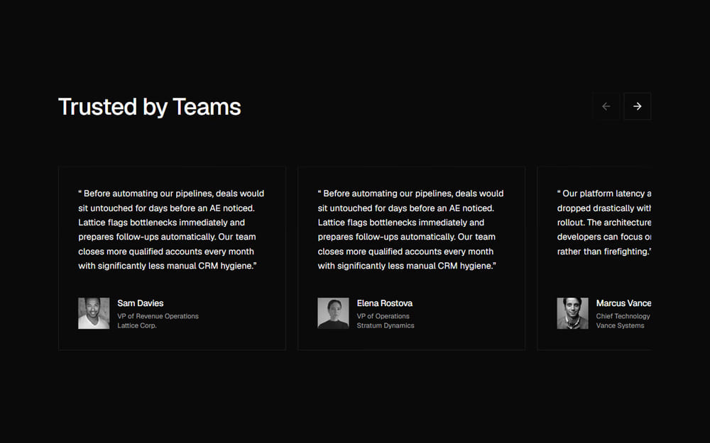
A shadcn/ui testimonials carousel for SaaS and B2B sites: sharp monochrome cards with customer quotes, author bios, and previous/next controls.
> For the complete documentation index, see [llms.txt](/llms.txt). Markdown variants are available for the docs, pricing and about pages: append `.md` to the URL or send an `Accept: text/markdown` header (the home page answers the header too). An agent skill is available at [/.well-known/agent-skills/site-skill.md](/.well-known/agent-skills/site-skill.md).
## At a glance
- **Good for:** SaaS and B2B product landing pages; Developer tool and software showcase sites; Customer proof and wall-of-love pages
- **Category:** Marketing · **Type:** Testimonials · **Style:** Minimal, Dark mode, Motion
- **See it:** [Live preview](https://www.craftui.space/docs/templates/testimonials-section-02) · [Screenshot](https://www.craftui.space/llms.md/preview/testimonials-section-02.22812d8b.jpg)
## Install
```bash
pnpm dlx shadcn@latest add https://www.craftui.space/r/testimonials-section-02.json
```
This is a paid item (SEC-0013): the install needs a craftUI plan or a purchase of it. Signed in, the docs page gives your personal install command. Plans: https://www.craftui.space/pricing
## Usage
```tsx
import TestimonialsSection02 from "@/components/blocks/testimonials-section-02";
export default function Page() {
return ;
}
```
With no props it renders with demo content; pass your own through the props below.
## Props
| Prop | Type | Default | Description |
| --- | --- | --- | --- |
| `title` | `ReactNode` | `"Trusted by Teams"` | Main section heading. Defaults to "Trusted by Teams". |
| `testimonials` | `TestimonialItem[]` | — | Customer testimonial items. If omitted, default sample stories are shown. If passed as an empty array, no stories are rendered. |
| `headingLevel` | `1 \| 2 \| 3` | `2` | The heading's level: 1 when this is the page's main heading, 2 or 3 to fit under the page's own. Defaults to 2. |
It also accepts every `` attribute (`className`, `id`, `aria-*` and so on).
### `TestimonialItem`
| Field | Type | Description |
| --- | --- | --- |
| `id` (required) | `string` | Unique identifier for the story. |
| `author` (required) | `TestimonialAuthor` | Author details including name, role, company and avatar. |
| `quote` (required) | `string` | Customer quote text. Displayed enclosed in quotation marks. |
### `TestimonialAuthor`
| Field | Type | Description |
| --- | --- | --- |
| `name` (required) | `string` | The customer's full name, e.g. "Sam Davies". |
| `role` (required) | `string` | Their job title or role, e.g. "VP of Revenue Operations". |
| `company` (required) | `string` | Their company or organization, e.g. "Lattice Corp.". |
| `avatar` (required) | `string` | Portrait photo URL. Rendered as a square monochrome avatar. |
## Files
The install adds:
- `components/blocks/testimonials-section-02.tsx`
npm dependencies (installed for you): `lucide-react`, `motion`.