# Artwork fan hero
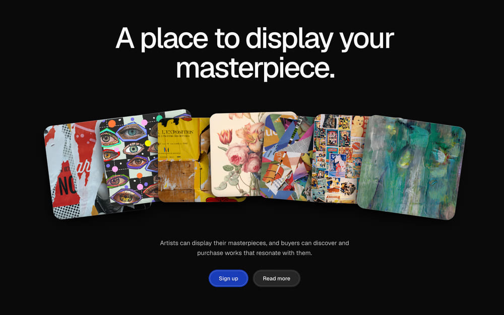
A shadcn/ui hero for art marketplaces and creator platforms: a fan of artworks that turn over in 3D to show the artist and price.
> For the complete documentation index, see [llms.txt](/llms.txt). Markdown variants are available for the docs, pricing and about pages: append `.md` to the URL or send an `Accept: text/markdown` header (the home page answers the header too). An agent skill is available at [/.well-known/agent-skills/site-skill.md](/.well-known/agent-skills/site-skill.md).
## At a glance
- **Good for:** Art marketplaces and print shops; Creator, illustrator and designer platforms; Portfolio and gallery sites that lead with the work; Membership launches for creative communities
- **Category:** Portfolio, Marketing · **Type:** Hero · **Style:** Motion, Dark mode
- **See it:** [Live preview](https://www.craftui.space/docs/templates/hero-section-03) · [Screenshot](https://www.craftui.space/llms.md/preview/hero-section-03.63b69705.jpg)
## Install
```bash
pnpm dlx shadcn@latest add https://www.craftui.space/r/hero-section-03.json
```
This is a paid item (SEC-ASPCPD): the install needs a craftUI plan or a purchase of it. Signed in, the docs page gives your personal install command. Plans: https://www.craftui.space/pricing
## Usage
```tsx
import HeroSection03 from "@/components/blocks/hero-section-03";
export default function Page() {
return ;
}
```
With no props it renders with demo content; pass your own through the props below.
## Props
| Prop | Type | Default | Description |
| --- | --- | --- | --- |
| `heading` | `ReactNode` | `( <> A place to display your
masterpiece. <…` | The headline. Default "A place to display your masterpiece.", breaking after "your" from tablets up. |
| `description` | `ReactNode` | `"Artists can display their masterpieces, and buyers can discover and purchase w…` | The line under the fan, up to about 140 characters. |
| `artworks` | `Artwork[]` | `built-in demo content` | Up to 7 artworks, left to right: phones show the first 4, tablets 5, desktops all 7. Defaults are placeholder photos. |
| `hint` | `string` | `"hover to know the artist"` | The hand-drawn hint over the fan for mice and pens, up to about 26 characters. Empty to hide it. |
| `touchHint` | `string` | `"tap to know the artist"` | The same hint for touch screens, where there is no hover. |
| `primaryAction` | `ArtworkAction` | `built-in demo value` | The filled pill action. |
| `secondaryAction` | `ArtworkAction` | `built-in demo value` | The quiet pill action beside it. |
| `headingLevel` | `1 \| 2` | `1` | The headline's level: 1 when this hero opens the page (default), 2 inside a longer page. |
| `className` | `string` | — | Classes for the section. |
### `Artwork`
| Field | Type | Description |
| --- | --- | --- |
| `src` (required) | `string` | Image URL. Square-ish works best (the card is 100:95); it is cropped to fill. |
| `alt` (required) | `string` | What the artwork shows, for screen readers, e.g. "Collage of torn red posters". |
| `title` | `string` | The work's title, on the card's back, up to about 24 characters ("Late Bloom"). |
| `artist` | `string` | The artist's name, on the back. Without it the card comes out but doesn't turn over. |
| `handle` | `string` | The artist's handle, under their name ("@hanasato"). |
| `medium` | `string` | Medium, up to about 16 characters ("Gouache on paper"). |
| `year` | `string` | Year made ("2025"). |
| `price` | `string` | Price as shown ("$520"). |
| `status` | `string` | Status beside the price ("Available", "Sold"). Default "Available". |
### `ArtworkAction`
| Field | Type | Description |
| --- | --- | --- |
| `href` (required) | `string` | Where the button goes: a page, an anchor ("#pricing") or a mailto: link. |
| `label` (required) | `string` | The button's text, e.g. "Sign up". |
## Files
The install adds:
- `components/blocks/hero-section-03.tsx`
No npm dependencies beyond React and Tailwind CSS.