# Developer tool features
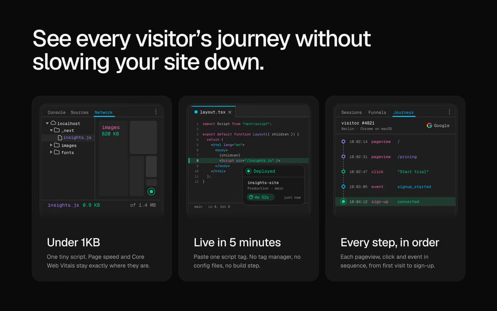
A shadcn/ui features section for developer tools and SaaS that need to prove their claims: three cards drawn as DevTools, a code editor and a dashboard.
> For the complete documentation index, see [llms.txt](/llms.txt). Markdown variants are available for the docs, pricing and about pages: append `.md` to the URL or send an `Accept: text/markdown` header (the home page answers the header too). An agent skill is available at [/.well-known/agent-skills/site-skill.md](/.well-known/agent-skills/site-skill.md).
## At a glance
- **Good for:** SaaS and analytics product landing pages; Developer tool feature overviews; Product pages that explain an approach in three points
- **Category:** Marketing, Data · **Type:** Features · **Style:** Minimal, Dark mode
- **See it:** [Live preview](https://www.craftui.space/docs/templates/feature-section-02) · [Screenshot](https://www.craftui.space/llms.md/preview/feature-section-02.a1d12bce.jpg)
## Install
```bash
pnpm dlx shadcn@latest add https://www.craftui.space/r/feature-section-02.json
```
This is a paid item (SEC-0010): the install needs a craftUI plan or a purchase of it. Signed in, the docs page gives your personal install command. Plans: https://www.craftui.space/pricing
## Usage
```tsx
import FeatureSection02 from "@/components/blocks/feature-section-02";
export default function Page() {
return ;
}
```
With no props it renders with demo content; pass your own through the props below.
## Props
| Prop | Type | Default | Description |
| --- | --- | --- | --- |
| `heading` | `ReactNode` | `"See every visitor’s journey without slowing your site down."` | The big line above the cards: the outcome the features add up to. Defaults to "See every visitor's journey without slowing your site down." |
| `features` | `FeatureSection02Item[]` | `built-in demo content` | The cards, in order. Three fill a row on tablets and desktops; phones stack them. |
| `headingLevel` | `1 \| 2 \| 3` | `2` | The heading's level: 1 when this is the page's main heading, 2 or 3 to fit under the page's own. The card titles take the next level. Defaults to 2. |
It also accepts every `` attribute (`className`, `id`, `aria-*` and so on).
### `FeatureSection02Item`
| Field | Type | Description |
| --- | --- | --- |
| `id` (required) | `string` | Unique id: the list keys on it. |
| `title` (required) | `string` | The card's title. Lead with the number or the result when there is one: "Under 1KB", "Live in 5 minutes". |
| `description` (required) | `string` | One or two short sentences under the title, about 80 characters at most, so every card's title lines up. |
| `icon` (required) | `ReactNode` | The drawing above the title. Use `FeatureBundleIcon`, `FeatureDeployIcon` or `FeatureJourneyIcon` from this file, or any SVG that shows the card's claim, drawn on a 240 × 226 canvas with its content in the top 210: the card scales it to its width and fades the bottom. |
| `href` | `string` | Where the card leads, e.g. "/docs/install". The whole card becomes a link, with an arrow after the title. Leave it out for a plain card. |
## Files
The install adds:
- `components/blocks/feature-section-02.tsx`
No npm dependencies beyond React and Tailwind CSS.
shadcn/ui components it uses (the shadcn CLI adds any that are missing): `card`.